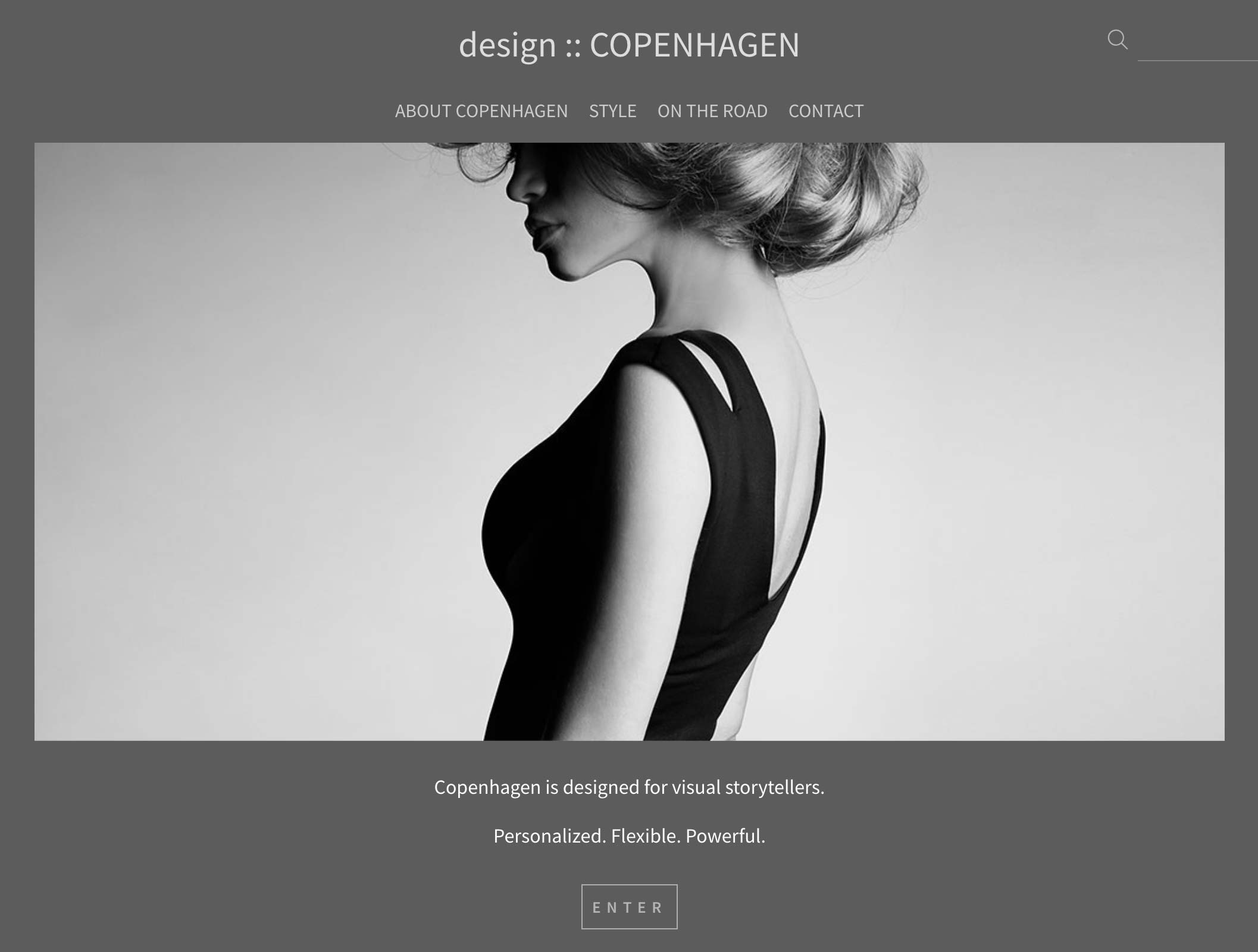
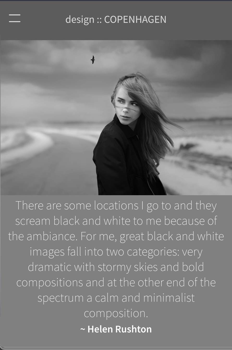
Copenhagen is a fully "responsive" and mobile-compatibile design and includes some very cool features to display your galleries. As in all of our designs, you can display your home page as a full-screen image slideshow with different overlays for your logo and navigational links. Copenhagen's standard home page displays with a slideshow at the top with any home page text you enter below. The slide show can be displayed normally or with the "Ken Burns" display option.
Also included is an optional image search option. A subtle search option appears on the top of your pages - the search will look through your captions and gallery names.
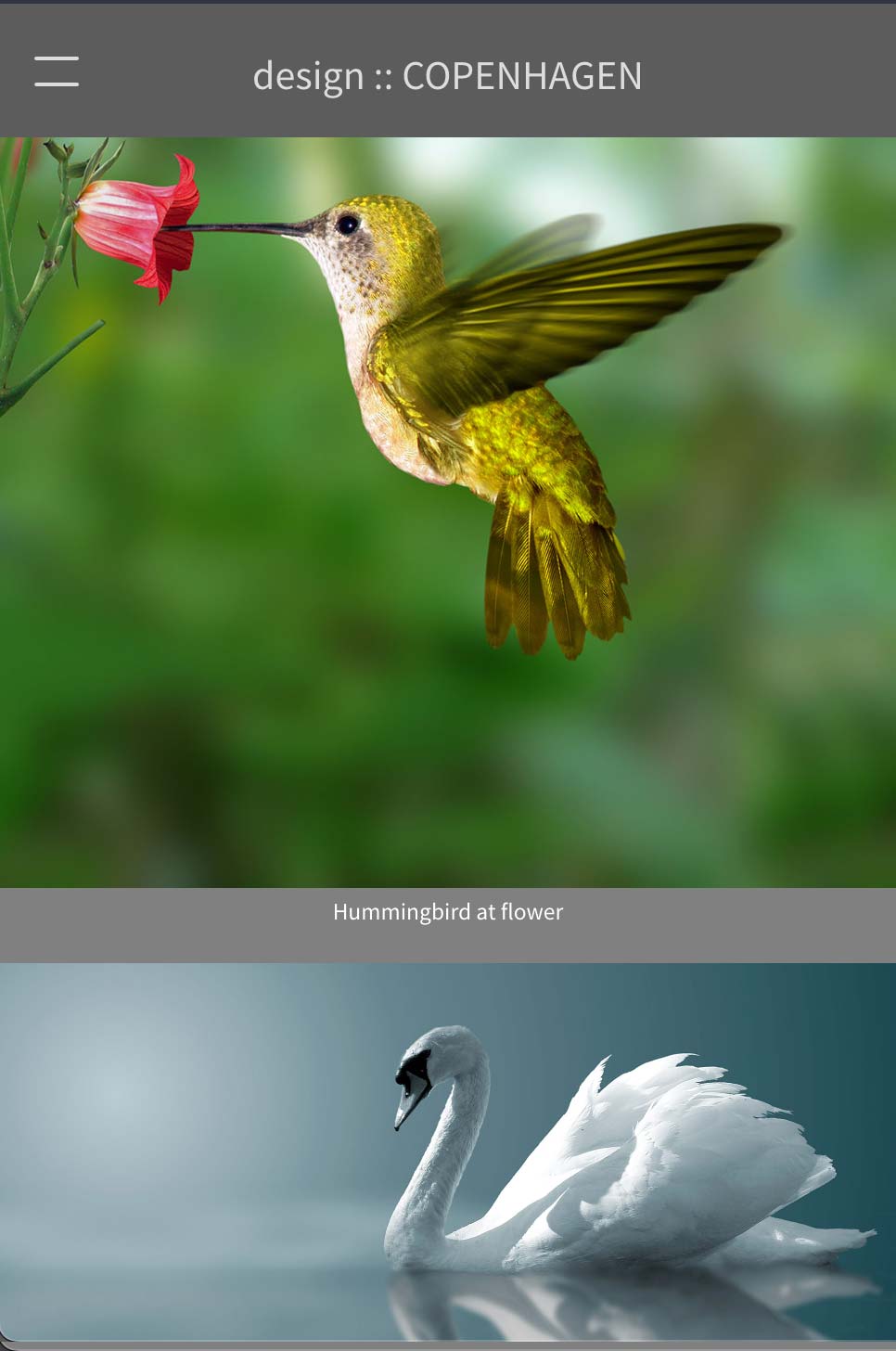
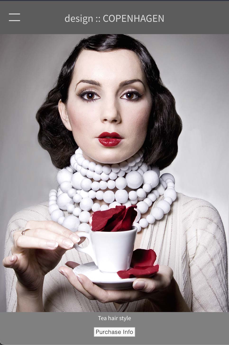
We recently added a nifty feature that lets you choose the image display width in your galleries. With Copenhagen, images display in a vertically-scrolling area. If your display area is large, it can also make the image heights appear quite deep compared to the horizontal images. Constraining the content display width to a smaller size (as narrow as 750 pixels) can give you a much nicer display, depending on your content.
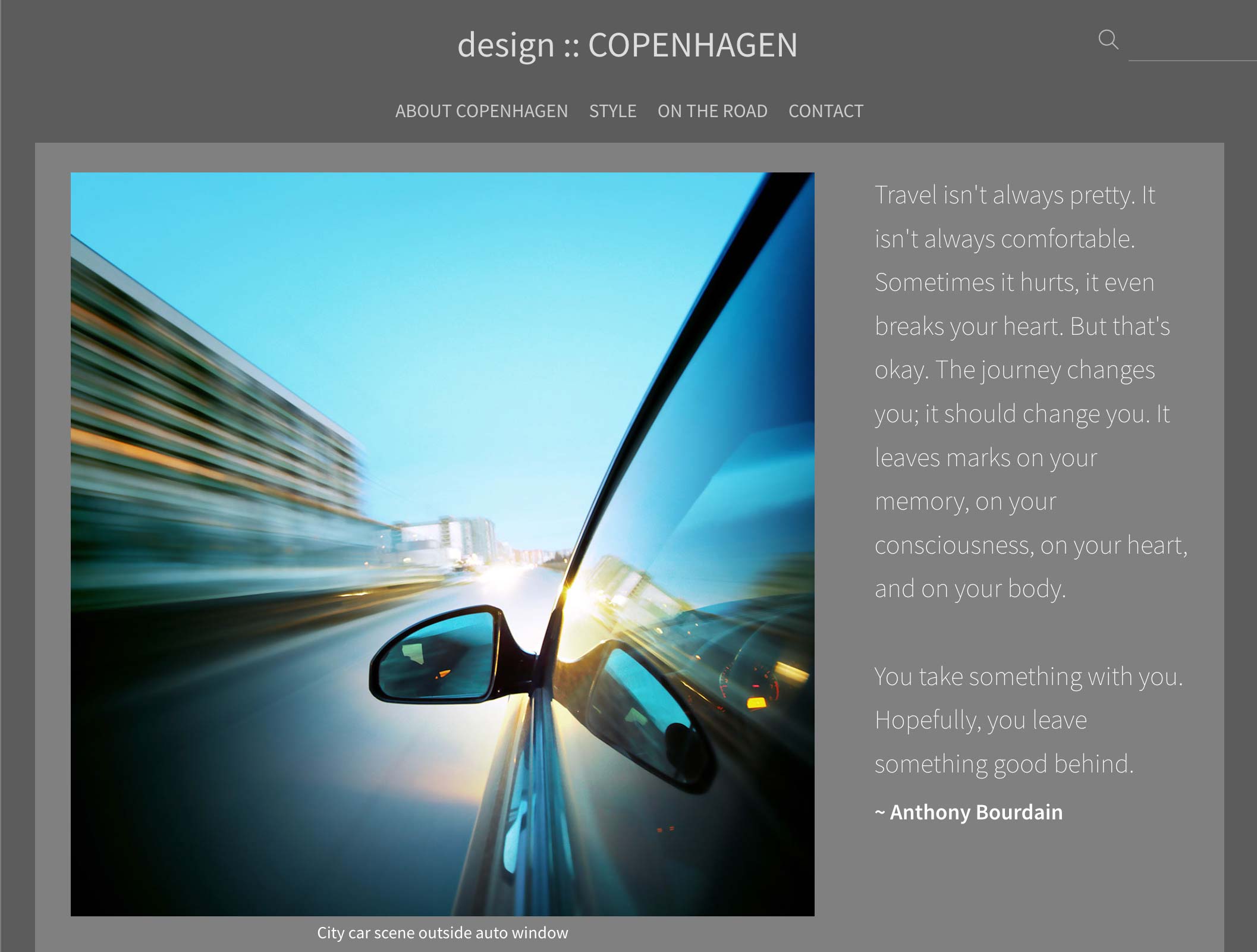
Our latest feature for Copenhagen is an option to display any introductory text for your galleries to display to the left, right or center of your gallery images. Your gallery text maintains it position towards the top of the page as you scroll down through the images. On mobile, the gallery intro text displays above the images. All of these options can be found in our SiteManager in the Designs section / Copenhagen.